Shopping for fabric should be fun! Unfortunately, many new quilters find it frustrating.
When you walk into a craft store, quilting fabrics are typically arranged by color. It can feel daunting to select different colors and prints for a quilt, especially if you want to use more than two or three fabrics in your design.
How do you find just the right background color? How do you know if your prints are too big? Will all of these fabrics look good together? There are so many different things to consider.
In this post, we’re going to give you some tips on coordinating colors and prints for a quilt. We hope you can gain some confidence so that fabric shopping becomes a satisfying experience. It’s true that some people have a good eye for selecting fabrics, but it’s also a skill you can develop.
Basic Color Theory
First, shopping for coordinating fabrics becomes easier when you know a little color theory. I want you to go back to grade school with me for a moment... You probably remember that there are three primary colors (red, yellow, and blue) and three secondary colors (orange, green, and violet). Do you remember arranging them on a color wheel?

If you want to make a quilt with colors that pop, choose colors that are directly opposite of each other on the color wheel (red and green, yellow and violet, blue and orange). These are called “complementary colors.” When placed side-by-side these contrasting hues appear brighter than when used alone.
You also can’t go wrong with colors that form an equilateral triangle on the color wheel (red, yellow, and blue). These are called “triadic colors.” Colors directly next to each other on the color wheel also look good together (green and blue, yellow and orange, etc.) These are called “analogous colors.”
See how the basic colors coordinate and pop in this Love Everywhere Quilt from True Fabrics:

Of course, this is just simple color theory. Choosing fabrics becomes more complicated when you also think about tone.
Choosing Color Tones and Neutrals
Quilts look best when they have a mix of dark, medium, and light tones. It’s impossible to find a color wheel that shows you all of the colors and their complementary and analogous shades! Just keep the basic color theory principles in mind when you shop. And, if you think two fabrics look good together, that’s all that really matters.
Neutrals like white, gray, taupe, beige, and black are essential for a balanced quilt design. They are commonly used as a background fabric. When combined with other colors, neutral shades can provide contrast and depth without overpowering the entire piece.
See how the white background color on the Star Light Quilt makes the whole quilt feel bold?

Combining Prints and Solids
Solid colors are the easiest to coordinate, but you can have so much fun with prints! When I shop for fabric, I find that it’s easiest to start with a print that I love and work around it. First, I try to find some solids or batiks that look good with my main print. Then, I move into adding complimentary prints and colors. It takes practice but take your time and have fun with the process.
Just like you should have a mix of light and dark tones, it also looks nice if you have a mix of small and large prints. Using only really small prints can make your quilt look too busy.
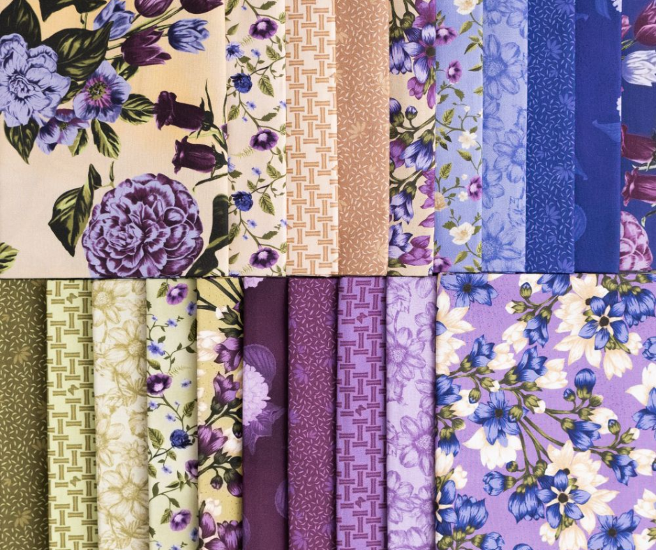
If you’re really new to the process, it helps to look at fabric collections that have been put together by designers. See how these fabric collections all have a mix of light and dark tones and different size prints:
Sunshine Blooms by True Fabrics

Vintage Lane by True Fabrics

Wildflowers by True Fabrics

En Rogue by True Fabrics

I actually like to shop for quilt fabric online because you can see collections as a whole. Love Sew only sells premium quality quilting fabric and the collections were thoughtfully designed by a professional.
Choosing coordinating prints for a quilt does take practice, but it is something you can learn. Of course, if you’d rather get to the sewing part faster, you can always purchase a quilt kit. Love Sew is constantly coming out with new quilt kits that have perfectly coordinated fabrics and amazing patterns to follow.
Do you have any helpful tips to share about how you choose fabric for a quilt? Leave your comments below.
7 comments
Carol Ann Heffernan
Thanks for this article!
I usually have plans in my head, have pieces I want to use but always have trouble finding the “right” filler pieces! Always a work in progress and a process in the works ☺️
Pam Hart
Choosing colors that go together should be part of the fun. I love learning about color as this is most difficult for me. I don’t always look for the most obvious color combinations.
Sandra Giacomini
I remember when I was stuck on purple and a friend told me to step out of the box. Wow what fun after that.
Sandra Giacomini
I remember when I was stuck on purple and a friend told me to step out of the box. Wow what fun after that.
Angie Sexson
Nice article!
Leave a comment
This site is protected by hCaptcha and the hCaptcha Privacy Policy and Terms of Service apply.